Animated Login Page Using HTML, CSS & JavaScript

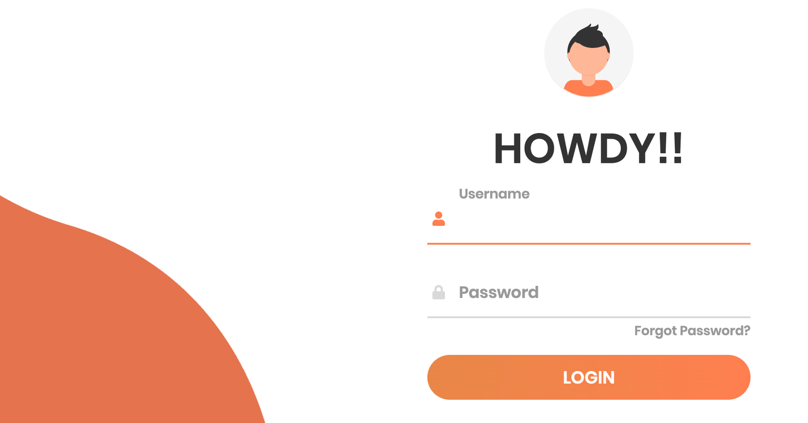
In this Article, learn How to build Animated Login Form with some effects & also i have used isometric image to give its amazing look. It is important to have a login form that is not only interactive but also one that looks good. A professional-looking user login & registration page makes your users trust your site.
SOURCE CODE DOWNLOAD
For Demo & Source Code Scroll down.
In this animated login form it's packed with features like:
- 1. 100% responsive
- 2. Compatible on all devices
- 3. Language used HTML5, CSS3, and JavaScript
- 4. Interactive animations with isometric image
Let's start building this Responsive Login Form.
#Markup
<img class="wave" src="img/wave.png" />
<div class="container">
  <div class="img"></div>
  <div class="login-content">
    ....
  </div>
</div>
In this markup, we have defined the structure of css login form to be build using css animation. Also this animated login form is fully responsive & integrated with font awesome in input field to give more professional look.
Now let's define structure of login form.
<form action="index.html">
  <img src="img/avatar.svg" />
  <h2 class="title">Howdy!!</h2>
  <div class="input-div one">
    <div class="i">
      <i class="fas fa-user"></i>
    </div>
    <div class="div">
      <h5>Username</h5>
      <input type="text" class="input" />
    </div>
  </div>
  <div class="input-div pass">
    <div class="i">
      <i class="fas fa-lock"></i>
    </div>
    <div class="div">
      <h5>Password</h5>
      <input type="password" class="input" />
    </div>
  </div>
  <a href="#">Forgot Password?</a>
  <input type="submit" class="btn" value="Login" />
</form>
# CSS
Now, login form structure is all set. It's time to style it & give them effects which will look realistic login form.
* {
  padding: 0;
  margin: 0;
  box-sizing: border-box;
}

body {
  font-family: "Poppins", sans-serif;
  overflow: hidden;
}

.wave {
  position: fixed;
  bottom: 0;
  left: 0;
  height: 100%;
  z-index: -1;
}

.container {
  width: 100vw;
  height: 100vh;
  display: grid;
  grid-template-columns: repeat(2, 1fr);
  grid-gap: 7rem;
  padding: 0 2rem;
}

.img {
  display: flex;
  justify-content: flex-end;
  align-items: center;
}

.login-content {
  display: flex;
  justify-content: flex-start;
  align-items: center;
  text-align: center;
}

.img img {
  width: 500px;
}

form {
  width: 360px;
}

.login-content img {
  height: 100px;
}

.login-content h2 {
  margin: 15px 0;
  color: #333;
  text-transform: uppercase;
  font-size: 2.9rem;
}

.login-content .input-div {
  position: relative;
  display: grid;
  grid-template-columns: 7% 93%;
  margin: 25px 0;
  padding: 5px 0;
  border-bottom: 2px solid #d9d9d9;
}

.login-content .input-div.one {
  margin-top: 0;
}

.i {
  color: #d9d9d9;
  display: flex;
  justify-content: center;
  align-items: center;
}

.i i {
  transition: 0.3s;
}

.input-div > div {
  position: relative;
  height: 45px;
}

.input-div > div > h5 {
  position: absolute;
  left: 10px;
  top: 50%;
  transform: translateY(-50%);
  color: #999;
  font-size: 18px;
  transition: 0.3s;
}

.input-div:before,
.input-div:after {
  content: "";
  position: absolute;
  bottom: -2px;
  width: 0%;
  height: 2px;
  background-color: coral;
  transition: 0.4s;
}

.input-div:before {
  right: 50%;
}

.input-div:after {
  left: 50%;
}

.input-div.focus:before,
.input-div.focus:after {
  width: 50%;
}

.input-div.focus > div > h5 {
  top: -5px;
  font-size: 15px;
}

.input-div.focus > .i > i {
  color: coral;
}

.input-div > div > input {
  position: absolute;
  left: 0;
  top: 0;
  width: 100%;
  height: 100%;
  border: none;
  outline: none;
  background: none;
  padding: 0.5rem 0.7rem;
  font-size: 1.2rem;
  color: #555;
  font-family: "poppins", sans-serif;
}

.input-div.pass {
  margin-bottom: 4px;
}

a {
  display: block;
  text-align: right;
  text-decoration: none;
  color: #999;
  font-size: 0.9rem;
  transition: 0.3s;
}

a:hover {
  color: coral;
}

.btn {
  display: block;
  width: 100%;
  height: 50px;
  border-radius: 25px;
  outline: none;
  border: none;
  background-image: linear-gradient(to right, #e88747, coral, #e88747);
  background-size: 200%;
  font-size: 1.2rem;
  color: #fff;
  font-family: "Poppins", sans-serif;
  text-transform: uppercase;
  margin: 1rem 0;
  cursor: pointer;
  transition: 0.5s;
}
.btn:hover {
  background-position: right;
}
This will style up login form. Also used isometric image in SVG format which will more professional look to the login form. Now, above CSS is used to style-up login form but it's time to make login form responsive using media query.
@media screen and (max-width: 1050px) {
  .container {
    grid-gap: 5rem;
  }
}

@media screen and (max-width: 1000px) {
  form {
    width: 290px;
  }

  .login-content h2 {
    font-size: 2.4rem;
    margin: 8px 0;
  }

  .img img {
    width: 400px;
  }
}

@media screen and (max-width: 900px) {
  .container {
    grid-template-columns: 1fr;
  }

  .img {
    display: none;
  }

  .wave {
    display: none;
  }

  .login-content {
    justify-content: center;
  }
}
# JavaScript
It's, time give some animation effect to this login form by using javascript. We will use effect when user click on input field then a color effect on that field will active for that code defined below.
const inputs = document.querySelectorAll(".input");

function addClass() {
  let parent = this.parentNode.parentNode;
  parent.classList.add("focus");
}

function removeClass() {
  let parent = this.parentNode.parentNode;
  if (this.value == "") {
    parent.classList.remove("focus");
  }
}

inputs.forEach((input) => {
  input.addEventListener("focus", addClass);
  input.addEventListener("blur", removeClass);
});
You will get all files, when you download the source code. And after than you can edit it according to you
if you face any issues you can contact by asking question with article link.
You can go through Demo as well as Download source code for the same & make changes according to you
Hints Staff
I always try to upload useful article for users of HTML HINTS which will help them to learn more about Web Technologies.
More From The Author
Build a Facebook Clone with React and Firebase
In this FREE LIVE training, Qazi and Sonny will build a Facebook Clone LIVE with REACT JS and Fireba...
What is Deno & is it time to move on Deno over Node.js?
Deno.js is finally released its 1.0.0. release date on May 13th, 2020. In this ...
How To Change URL Without Reloading Page Using Javascript
How to change URL without refreshing the browser. In this article, we are looking into updating the ...
Upload Youtube Video using PHP
If you are looking for a solution to upload video on youtube via your own website. Then you are at r...
How to make a whatsapp bot in python
Learn how to send an unlimited messages by using terminal to a group or any individual person from y...
Get Query Parameters From a URL in JavaScript
URL parameters (also called query string parameters or URL variables) are used to send small amounts...