How To Build Responsive Navbar With Dropdown Menu Using Bootstrap

In this article we’ll go through all the steps required to build a Dropdown Navigation Bar Using Bootstrap and we will see how to make it Responsive with some animation effects.
it’s important that websites be fully responsive. You will have users visiting your site from both desktop and mobile phones. And the number of mobile users is steadily increasing. So, as a web developer, it’s your job to make sure that your website looks good & is fully responsive for all devices no matter what device your audience is using.
SOURCE CODE DOWNLOAD
For Demo & Source Code Scroll down.
Navigation Bar must be a top priority section for any website as when user visit your site, Navigation bar is the one which get user attention. So, its really important to make your navigation bar more presentable also fully responsive
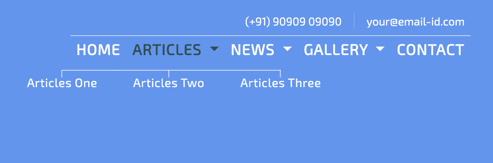
In Responsive Navigation Bar, dropdown menu will be designed & will be displayed like in below image rather than standard dropdown.

#Creating the structure with HTML Markup
<nav class="navbar navbar-expand-lg d-lg-block d-none col-11 mt-3">
  <div
    id="navbarSupportedContent"
    class="collapse navbar-collapse col-12 justify-content-end"
  >
    <div>

      <div class="d-flex justify-content-right">
        <ul class="navbar-nav ml-auto">
          <li class="nav-item">
            <a class="nav-link" href="#"
              >Home <span class="sr-only">(current)</span></a
            >
          </li>
          <li class="nav-item dropdown">
            <a
              class="nav-link dropdown-toggle"
              href="#"
              id="navbarDropdownMenuLink"
              role="button"
              data-toggle="dropdown"
              aria-haspopup="true"
              aria-expanded="false"
            >
              Articles
            </a>
          </li>
          <li class="nav-item dropdown">
            <a
              class="nav-link dropdown-toggle"
              href="#"
              id="navbarDropdownMenuLink"
              role="button"
              data-toggle="dropdown"
              aria-haspopup="true"
              aria-expanded="false"
            >
              News
            </a>
          </li>
          <li class="nav-item dropdown">
            <a
              class="nav-link dropdown-toggle"
              href="#"
              id="navbarDropdownMenuLink"
              role="button"
              data-toggle="dropdown"
              aria-haspopup="true"
              aria-expanded="false"
            >
              Gallery
            </a>
          </li>
          <li class="nav-item"><a class="nav-link" href="#">Contact</a></li>
        </ul>
      </div>
    </div>
  </div>
</nav>
Above, HTML structure will give output of a simple bootstrap navigation bar without any Dropdown Menu & effect. For Dropdown code below.
<div
  class="dropdown-menu"
  aria-labelledby="navbarDropdownMenuLink">
  <a class="dropdown-item" href="#">Articles One</a>
  <a class="dropdown-item" href="#">Articles Two</a>
  <a class="dropdown-item" href="#">Articles Three</a>
</div>
Above code will place in <li> tag & will make
that in dropdown menu.
#Adding style
For dropdown effect with a line above dropdown menu are done by using Before & After elements of CSS. Code for same below.
.dropdown-menu {
  min-width: 550px;
  background: transparent;
  left: calc(50% - 275px);
  border: 0px;
  text-align: center;
}
.dropdown-item {
  display: inline-block;
  width: auto;
  font-size: 16px;
  font-weight: 200;
  letter-spacing: 0.45px;
  line-height: 14px;
  color: #ffffff;
  position: relative;
  clear: inherit;
  padding: 10px 1.5rem;
  margin-left: -4px;
}
.dropdown-item::before {
  content: "";
  width: 100%;
  height: 1px;
  position: absolute;
  background: rgba(255, 255, 255, 0.8);
  left: 0px;
  top: 0px;
}
.dropdown-item::after {
  content: "";
  width: 1px;
  height: 10px;
  position: absolute;
  background: rgba(255, 255, 255, 0.8);
  left: calc(50% - 1px);
  top: 0px;
}
.dropdown-item:first-child::before {
  width: 50%;
  left: 50%;
}
.dropdown-item:last-child::before {
  width: 50%;
  right: 50%;
}
.dropdown-item:hover {
  background: transparent;
  color: darkslategrey;
}
And now for mobile view, toggle animation is done by using CSS & will initiate when user click on Hamburger.
.overlay {
  position: fixed;
  background: #101318;
  top: 0;
  left: 0;
  width: 100%;
  height: 0%;
  opacity: 0;
  visibility: hidden;
  -webkit-transition: opacity 0.35s, visibility 0.35s, height 0.35s;
  transition: opacity 0.35s, visibility 0.35s, height 0.35s;
  overflow: hidden;
}
.overlay.open {
  opacity: 1;
  visibility: visible;
  height: 100%;
  z-index: 10;
}
.overlay.open li {
  -webkit-animation: fadeInRight 0.5s ease forwards;
  animation: fadeInRight 0.5s ease forwards;
  -webkit-animation-delay: 0.35s;
  animation-delay: 0.35s;
}
.overlay.open li:nth-of-type(2) {
  -webkit-animation-delay: 0.4s;
  animation-delay: 0.4s;
}
.overlay.open li:nth-of-type(3) {
  -webkit-animation-delay: 0.45s;
  animation-delay: 0.45s;
}
.overlay.open li:nth-of-type(4) {
  -webkit-animation-delay: 0.5s;
  animation-delay: 0.5s;
}
.overlay nav {
  position: relative;
  height: 70%;
  top: 50%;
  -webkit-transform: translateY(-50%);
  transform: translateY(-50%);
  font-size: 25px;
  font-weight: 400;
  justify-content: flex-start;
  display: flex;
  font-weight: 300;
  line-height: 26px;
}
.overlay ul {
  list-style: none;
  margin: 0 auto;
  display: inline-block;
  position: relative;
  height: 100%;
}
.overlay ul li {
  display: block;
  height: 25%;
  position: relative;
  opacity: 0;
}
.overlay ul li a {
  display: block;
  position: relative;
  color: #fff;
  text-decoration: none;
  overflow: hidden;
}
.overlay ul li a:hover:after,
.overlay ul li a:focus:after,
.overlay ul li a:active:after {
  width: 100%;
}

@-webkit-keyframes fadeInRight {
  0% {
    opacity: 0;
    left: 20%;
  }
  100% {
    opacity: 1;
    left: 0;
  }
}
For toggle button, When user click on toggle button animation will perform as hamburger will turn into cross button & overlay will come from top.
.button_container {
  position: fixed;
  top: 5%;
  right: 2%;
  height: 27px;
  width: 35px;
  cursor: pointer;
  z-index: 100;
  -webkit-transition: opacity 0.25s ease;
  transition: opacity 0.25s ease;
}
.button_container:hover {
  opacity: 0.7;
}
.button_container.active .top {
  -webkit-transform: translateY(11px) translateX(0) rotate(45deg);
  transform: translateY(11px) translateX(0) rotate(45deg);
  background: #fff;
}
.button_container.active .middle {
  opacity: 0;
  background: #fff;
}
.button_container.active .bottom {
  -webkit-transform: translateY(-11px) translateX(0) rotate(-45deg);
  transform: translateY(-11px) translateX(0) rotate(-45deg);
  background: #fff;
}
.button_container span {
  background: white;
  border: none;
  height: 2px;
  width: 100%;
  position: absolute;
  top: 0;
  left: 0;
  -webkit-transition: all 0.35s ease;
  transition: all 0.35s ease;
  cursor: pointer;
}
.button_container span:nth-of-type(2) {
  top: 11px;
}
.button_container span:nth-of-type(3) {
  top: 22px;
}
#Adding JS
Javascript will be use in Mobile view when user click on toggle button to active mobile menu view. Code for the same below.
$('#toggle').click(function() {
  $(this).toggleClass('active');
  $('#overlay').toggleClass('open');
});
You will get all files, when you download the source code. And after than you can edit it according to you
if you face any issues you can contact by asking question with article link.
You can go through Demo as well as Download source code for the same & make changes according to you
More From The Author
How To Create Weather App Using React.js With Current Location & Search City
how to build weather application that performs two task. First, this app will show Real time weather...
What is HTML5?
HTML stands for Hypertext Markup Language. It is the basic language used to create Web Pages for Wor...
PHP MySQL CRUD Application (Build Blog Admin Panel Part-1)
In this Tutorial, Learn How To Buid Admin Panel Using PHP & MYSQL With CRUD Operation. CRUD Operatio...
How to remove .php .html extensions using .htaccess
In .htaccess, we going to remove file extension such as .php .html or anyother extension. To remove ...
How to disolve image in css with transition effect?
The filter property of img tag defines effects (like blur & saturation). Th...
Email validation in javascript using regular expression with match()
In javascript you can easily validate email by using many javascript function such as onkeyup() onch...