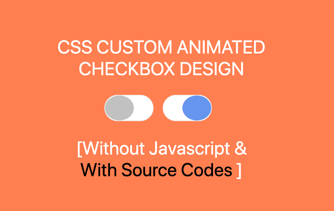
In this Article, you will learn
How to animate checkbox by using css.
You can use it on your websites after some changes as you
want. In this you will see Checkbox design is working
smoothly with transition effect from unchecked to checked by
user.
SOURCE CODE DOWNLOAD

For Demo & Source Code Scroll down.
In this i've hide the default checkbox & design it like a
switch & transit the color between switch is on or not. You
cam see the transition in demo given below. Let's get into
the code.
#Markup
<span class="checkbox switcher">
  <label for="switcher">
    <input type="checkbox" name="" id="switcher">
    <span><small></small></span>
  </label>
</span>
In above code,
<span></span>
this code will Creates a background for switch where
switcher will work &
<small></small> this will be
switcher button & this code will place between
<span></span>.
#CSS
  span.checkbox.switcher label input {
    display: none;
  }
In above CSS is used to hide default Checkbox & below code
is used to build custom checkbox/Switcher. Now question will
arise that if checkbox is hidden then how Toggle Switch will
work. It will handle by the for attribute such
as for="switcher" which will point to
id id="switcher" and now we
created custom checkbox inside label tag
defined with for attribute following this code
<span><small></small></span>.
  span.checkbox.switcher label input + span {
    position: relative;
    display: inline-block;
    margin-right: 10px;
    width: 75px;
    height: 40px;
    background-color: white;
    border-radius: 50px;
    border: 1px solid #eee;
    transition: all 0.3s ease-in-out;
    cursor: pointer;
  }
This CSS will create a White Background for switcher where
button need to place followed by below CSS.
    span.checkbox.switcher label input + span small {
      position: absolute;
      display: block;
      width: 60%;
      height: 100%;
      background-color: #c1c1c1;
      border-radius: 50%;
      transition: all 0.3s ease-in-out;
      left: 0;
    }
It'll create a static button but right now it will not work
as switcher as we need to define custom CSS when checkbox
will be checked
    span.checkbox.switcher label input:checked + span small {
      background-color: cornflowerblue;
      border-color: cornflowerblue;
      left: 40%;
    }
Now CSS Custom Animated Checkbox Design is
ready to use as you can see in above CSS have checked the
CSS, If user click on checkbox then Checked CSS will work
otherwise static CSS fpr button will show & to for
transition have used
transition: all 0.3s ease-in-out;, it will do
transition between checked & unchecked of input type
checkbox.
You will get all files,
when you
download the source code.
And after than you can edit it according to you
if you face any issues you can
contact by
asking question with article link.
You can go through Demo as
well as Download source
code for the same & make changes according to you


