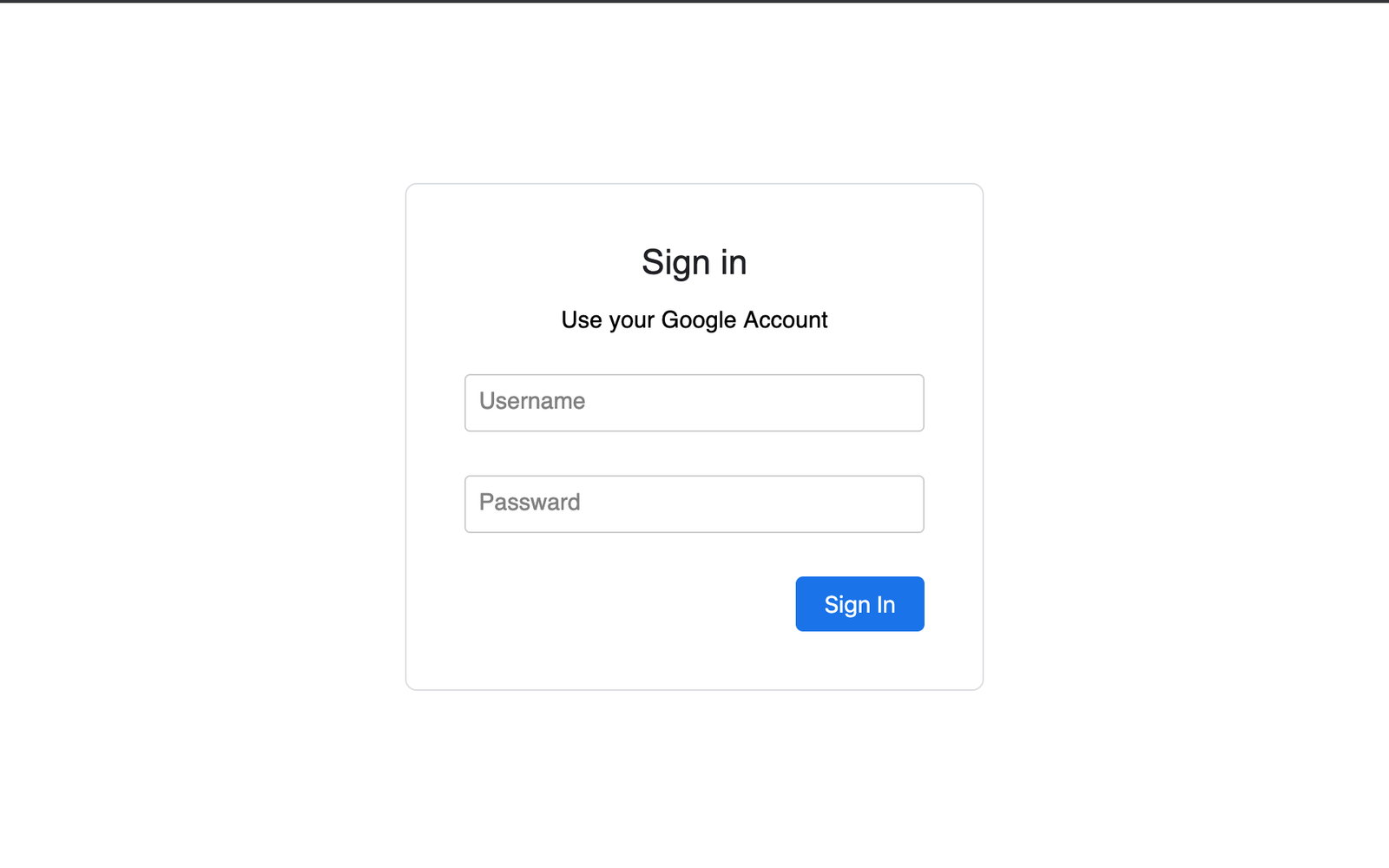
Google Login Form Design using HTML & CSS
In this tutorial, We going to show you that how you can make form look alike google animated form. Where when you click field to type details then label will animated to the top with css effects without using of javascript.
Lets start by creating three files:
- index.html - for our markup
- style.css - for styling
Here what our HTML file should look like:
In this markup, will create structure of Form. First, lets define input fields enclosed with in form tag of html.
Lets! go through the code.
        <form>
            <div class="inputBox">
                <input type="email" name="email" value="">
                <label>Username</label>
            </div>
            <div class="inputBox">
                    <input type="text" name="text" value="">
                    <label>Password</label>
                </div>
            <input type="submit" name="sign-in" value="Sign In">
        </form>
We used onkeyup() function of html 5 to keep label of input field on top when there will be some value's on the input field otherwise label will animated at its orignal position
onkeyup="this.setAttribute('value', this.value);"
Its time for CSS styling so it will look like google login form
            body {
                margin: 0;
                padding: 0;
                background-size: cover;
                font-family: sans-serif;
              }

              .box {
                position: absolute;
                top: 50%;
                left: 50%;
                transform: translate(-50%, -50%);
                width: 25rem;
                padding: 2.5rem;
                box-sizing: border-box;
                border: 1px solid #dadce0;
                -webkit-border-radius: 8px;
                border-radius: 8px;

              }

              .box h2 {
                margin: 0px 0 -0.125rem;
                padding: 0;
                color: #fff;
                text-align: center;
                color: #202124;
                font-family: 'Google Sans','Noto Sans Myanmar UI',arial,sans-serif;
                font-size: 24px;
                font-weight: 400;
              }

              .box p {
                font-size: 16px;
                font-weight: 400;
                letter-spacing: .1px;
                line-height: 1.5;
                margin-bottom: 25px;
                text-align: center;
              }

              .box .inputBox {
                position: relative;
              }

              .box .inputBox input {
                width: 93%;
                padding: 0.625rem 10px;
                font-size: 1rem;
                letter-spacing: 0.062rem;
                margin-bottom: 1.875rem;
                border: 1px solid #ccc;
                background: transparent;
                border-radius: 4px;

              }

              .box .inputBox label {
                position: absolute;
                top: 0;
                left: 10px;
                padding: 0.625rem 0;
                font-size: 1rem;
                color: grey;
                pointer-events: none;
                transition: 0.5s;
              }

              .box .inputBox input:focus ~ label,
              .box .inputBox input:valid ~ label,
              .box .inputBox input:not([value=""]) ~ label {
                top: -1.125rem;
                left: 10px;
                color: #1a73e8;
                font-size: 0.75rem;
                background-color: white;
                height: 10px;
                padding-left: 5px;
                padding-right: 5px;
              }
              .box .inputBox input:focus {
                outline: none;
                border: 2px solid #1a73e8;
              }
              .box input[type="submit"] {
                border: none;
                outline: none;
                color: #fff;
                background-color: #1a73e8;
                padding: 0.625rem 1.25rem;
                cursor: pointer;
                border-radius: 0.312rem;
                font-size: 1rem;
                float: right;
              }

              .box input[type="submit"]:hover {
                background-color: #287ae6;
                box-shadow: 0 1px 1px 0 rgba(66,133,244,0.45), 0 1px 3px 1px rgba(66,133,244,0.3);
              }
To control animation of label we used pure css no javascript below code you will see that how we managed to do that
        .box .inputBox input:focus ~ label,
        .box .inputBox input:valid ~ label,
        .box .inputBox input:not([value=""]) ~ label {
            top: -1.125rem;
            left: 10px;
            color: #1a73e8;
            font-size: 0.75rem;
            background-color: white;
            height: 10px;
            padding-left: 5px;
            padding-right: 5px;
        }
        .box .inputBox input:focus {
            outline: none;
            border: 2px solid #1a73e8;
        }
Take a look at the result. or download source code of Google Login Form. Subscribe Html Hints Newsletter & get daily updates for cool stuff's for free.